
What a podcast analytics dashboard should actually show.
A useful dashboard does not display every available metric. It shows the delivery, performance and business context required for the next client or operating decision.
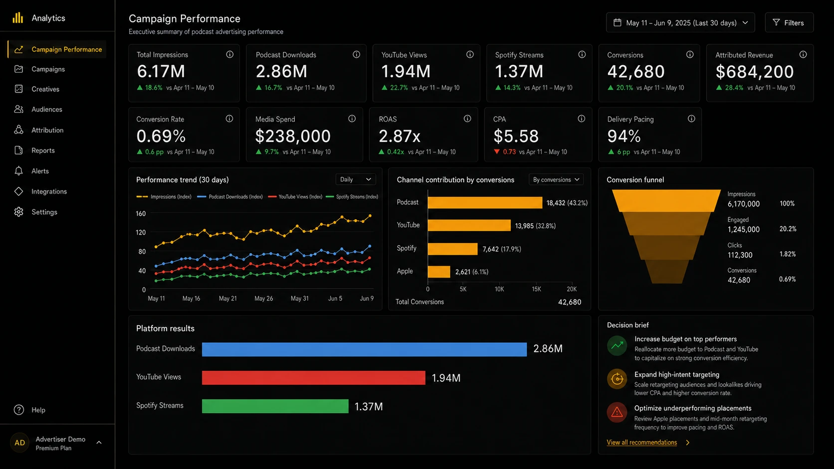
Illustrative example using fictional data. Final dashboards use the client's agreed sources, definitions and reporting periods.
Start with the question, not the chart
An account team needs to know whether a campaign is on pace. A client needs to understand cross-platform reach and response. A leader needs portfolio visibility across advertisers. Those are three different questions, and forcing them into one crowded view is how a dashboard ends up serving nobody in particular.
Decide whose Tuesday afternoon the view is built for before deciding what goes on it. Everything below assumes that decision has already been made.
The four layers, and what each one is for
Delivery: is the campaign fulfilling the commercial plan?
Booked volume, delivered volume, pacing against flight dates, remaining inventory and open exceptions. This is the layer account teams check most often and the one most frequently missing, because it cannot be built from platform data alone. It requires the booking record too. A view that shows consumption without the commitment behind it cannot tell anyone whether things are going well.
Consumption: what did the audience actually do?
Downloads, YouTube views, Spotify streams, and completion where the platform provides it. Keep every figure labeled with the platform it came from. The moment these are added together into a single audience total, the dashboard has made a claim it cannot defend.
Response: what happened after exposure?
Conversions, conversion rate, cost per action, attributed revenue and return on ad spend. Only show this layer when the campaign genuinely has the sources to support it. A return figure built on partial attribution is worse than no return figure at all, because it will be quoted back to you in a renewal conversation.
Decision context: what should happen next?
Trend direction, benchmark, material changes and recommended actions. This is what separates an operating tool from a status screen, and it is the layer most dashboards skip, because it is the one thing that cannot be generated from a data source. Somebody has to write it.
Where podcast numbers stop agreeing
Most dashboard disputes are not really about the dashboard. They surface because three systems measured three different things and the view presented them as one.
A download is not an impression
Hosting platforms count downloads. Ad servers count impressions. Sales counts contracted units. These three will not match, and none of them is wrong: they measure different events under different rules. Decide which one the contract is denominated in, label it plainly, and show the others as context rather than as competing answers.
Platform totals do not sum
Apple, Spotify and YouTube each apply their own counting thresholds and their own reporting lag. Adding them produces a number that exists nowhere except on your dashboard. Show the components. If a combined figure is genuinely needed, define it explicitly and state what it includes.
Attribution windows change the answer
The same campaign can look materially different at a seven-day window versus a thirty-day one, and platforms rarely default to the same setting. Fix the window, write it on the view, and resist changing it mid-flight. A window quietly changed between reporting periods is indistinguishable from a change in performance.
Podcast data arrives late and gets revised
These figures settle over days, not minutes. A dashboard read on the 1st and again on the 5th will disagree about the same month, and the client will notice before you do. Either state the settling period on the view itself or hold the period open until the numbers stop moving.
Settle the definitions before the first chart
The expensive dashboard problems are not visual. They happen when two teams use the same word for different things and nobody notices until a client puts two documents side by side.
Before anything gets built, agree four things for every metric and write them down:
- Name: what the client will call it, in their language rather than the platform's
- Source: which system is authoritative when two of them disagree
- Period: the reporting window, and the date it closes
- Owner: who decides when the definition needs to change
That exercise takes about an hour and prevents the conversation where an agency has to explain why the deck and the dashboard disagree.
What to leave off
Every metric on a dashboard is a promise to maintain it. A chart nobody uses still breaks when a source changes, still needs checking before a client sees it, and still costs credibility when it goes stale.
Leave off anything you cannot source reliably every cycle, anything that restates a figure already shown under a different name, and anything you would not be prepared to defend line by line. Density is not depth.
Live does not mean unmanaged
Sources change their APIs. Naming conventions drift as shows and advertisers are added. Exceptional delivery cases (a late episode, a bonus placement, a make-good carried into the next cycle) do not fit a schema designed before they happened.
A live view needs what a scheduled report needs: a named owner, a check before anything external sees it, and a defined process for updating the logic when the underlying operation changes. Without those, live only means the errors arrive faster.
The test for whether it is working
A dashboard is doing its job when the client stops asking your team to send an export, and when nobody internally has to verify a figure before answering a question about it. If either is still happening, the problem is usually not the charts.
Contents