
Are we on plan?
See total delivery, pacing, remaining inventory and the campaigns that need attention before the reporting deadline.
Bring campaign delivery, podcast downloads, YouTube views, Spotify streams, conversions, spend and attributed revenue into one maintained view. Clients get the answer without asking your team to rebuild the report.
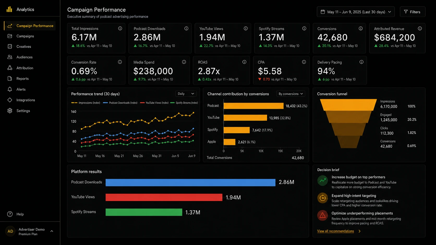
Illustrative example using fictional data. Final dashboards are tailored to each client's sources, metric definitions, branding and reporting requirements.
More charts do not create more clarity. The useful view connects campaign delivery, audience response and commercial outcome, then makes the exceptions obvious.
See total delivery, pacing, remaining inventory and the campaigns that need attention before the reporting deadline.
Keep podcast downloads, video views, streams, engagement and conversions inside the correct platform context.
Connect spend, attributed revenue, efficiency and a concise decision brief without turning the dashboard into a spreadsheet.
A polished chart is dangerous when the metrics underneath it do not share a definition. Every view should define what the total represents, show how each platform contributes to it and keep engagement and conversion separate so the figures reconcile.
The public example uses fictional figures. A live build is defined around the agency's agreed sources, reporting periods and client language.
A dashboard bought as a standalone tool tends to drift from the reports your team sends, because two surfaces built by two processes eventually disagree. Then a client puts them side by side and the conversation stops being about performance.
Here the dashboard is one output of reporting operations, drawing on the same reconciled figures and the same agreed metric definitions as your scheduled reports and QBR decks. Same data, same definitions, different surface, so the numbers always match.
These are working reporting environments built for active podcast operations. Client identities and exact commercial results are blurred; the information architecture, charting and reporting workflows are real.
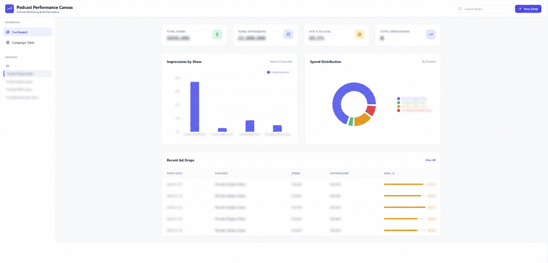
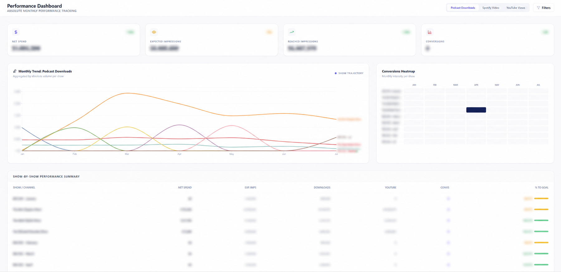
It should connect campaign delivery, podcast and video consumption, conversions, commercial efficiency and exceptions using definitions the agency and client agree on.
Yes. The goal is to improve the reporting operation around the tools already in use, not force a platform migration.
Yes. Views can be structured around the campaigns, advertisers and reporting periods each audience is permitted to see.
Not always. The dashboard provides an always-current operating view, while scheduled reports can preserve a period-specific narrative, approval record or executive summary.
No. Dashboards are one of the delivery formats inside reporting operations. The same reconciled data that produces your scheduled client reports feeds the dashboard, which is what keeps the two consistent.
Yes. Podrelay acts as a data processor under the EU and UK GDPR and signs a Data Processing Agreement before any access is granted. We work to data minimization: access is read-only and least-privilege, limited to the specific sources a dashboard needs, and we do not process individual listener identities. Dashboard views are permissioned so each audience sees only the campaigns and periods it is entitled to. Anything held on our side is encrypted in transit and at rest, restricted to named personnel, and returned or deleted on request or at the end of the engagement. Sub-processors are disclosed on request, personal data breaches are notified without undue delay, and confidentiality terms cover every client engagement.
We'll map what clients ask for, what the team rebuilds manually and where one maintained dashboard can remove the reporting loop.
Book a reporting infrastructure reviewWe reply within one business day.